Color Contrast
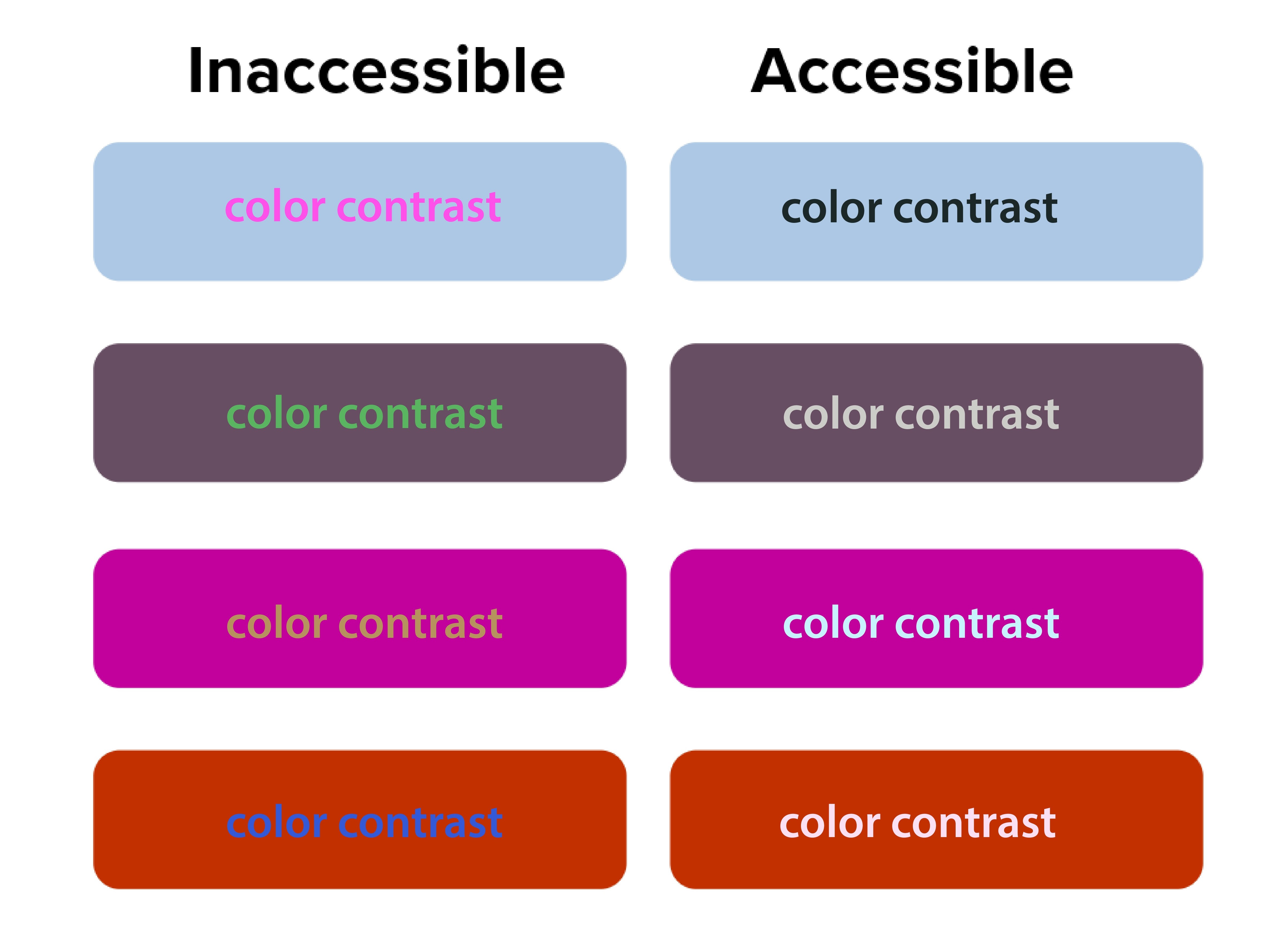
Color contrast is a critical aspect of web accessibility that ensures information is legible and perceivable by all users. It refers to the difference in light between the foreground (such as text or objects) and its background. The ability of one color to stand out from another determines whether people can read and understand the content effectively. However, relying solely on color to convey information can be problematic due to variations in color perception among different individuals and environments.
 Open the image full screen.
Why should I think about Color Contrast?
Consideration of color contrast is crucial for various user groups, including:
- Colorblind users: People with color vision deficiencies may have difficulty distinguishing certain colors. By ensuring sufficient contrast, you can enhance the legibility of content for colorblind users.
- Users in different lighting conditions: Viewing documents in bright sunlight or dimly lit environments can affect color perception. Adequate contrast helps maintain readability under varying lighting conditions.
- Users relying on adaptive technologies: Adaptive technologies, such as screen readers or magnifiers, may alter how colors appear on devices. By relying on color alone, important information may be missed by these users.
DOs and DON'Ts
To ensure inclusive design and accessibility, here are some dos and don'ts related to color contrast:
- Use additional visual cues: Instead of relying solely on color, incorporate other elements like bold text, italics, size variations, shapes, or icons to convey information. This helps users who may not perceive color accurately.
- Test for sufficient contrast: Utilize tools like the WebAIM Color Contrast Checker or the TPGi Color Contrast Checker to verify if your content meets the WCAG (Web Content Accessibility Guidelines) requirements for contrast. Ensure that the foreground and background colors have appropriate contrast ratios.
- Consider font size and weight: The WCAG guidelines define specific contrast ratios based on font size and weight. Adhere to these guidelines, such as using a minimum contrast ratio of 3:1 for normal text below 14 points, and 4.5:1 for 14-point bold or 18-point non-bold text.
- Rely solely on color: Avoid conveying important information or instructions solely through color. Users with color vision deficiencies or using adaptive technologies may miss crucial details.
- Use underlines for non-hyperlink text: Underlined text conventionally indicates hyperlinks. Avoid underlining non-link text to prevent confusion among users.
- Overuse italics: Excessive use of italics can reduce readability, particularly for users with visual impairments or reading difficulties. Reserve italics for emphasizing specific words or phrases in moderation.
- Choose contrasting colors: Select colors that have sufficient contrast when placed together. Consider using a color contrast checker tool to evaluate the contrast ratio between the foreground and background colors.
- Test across various devices and environments: Check how your design appears on different devices, screen sizes, and lighting conditions. Ensure the contrast remains adequate for users in different contexts.
- Use accessible color palettes: Utilize color palettes that offer a range of accessible color combinations. There are tools available, such as the Color Contrast Analyzer by The Paciello Group (TPGi) and the Color Contrast Accessibility Validator by A11Y Project, that can help you choose accessible color combinations.
- Seek user feedback: Involve users with diverse abilities in the design process. Conduct usability tests and gather feedback to ensure your design is accessible and meets their needs.