Manual Accessibility Check

Importance of Manual Checks
When reviewing a website, it is important to manually evaluate certain aspects and components to ensure the site meets accessibility standards. While many tests and evaluations can be handled by various automated tools, some components must be handled manually.
Accessibility Statement
- When developing a website, there should be an accessibility statement provided. If using a website, ensure the site has an accessibility statement to understand how accessible the site is before performing a manual evaluation. Click the following link to view San Diego State's Accessibility Statement: San Diego State Accessibility Statement.
Browser extensions
For many softwares, there are usable tools that aid in checking for accessibility of websites.
- Sa11y - visually highlights common accessibility and usability issues
- WAVE - Evaluation tool
- Axe DevTools - an accessibility webpage tester and visualization tool
- Silktide - website accessibility simulator (chrome extension)
- Experience the web with a range of simulated disabilities including:
- Color blindness
- Dyslexia
- Myopia / Blurred vision
- Blindness
- Tunnel vision / peripheral vision loss
- And more
- Experience the web with a range of simulated disabilities including:
Tests
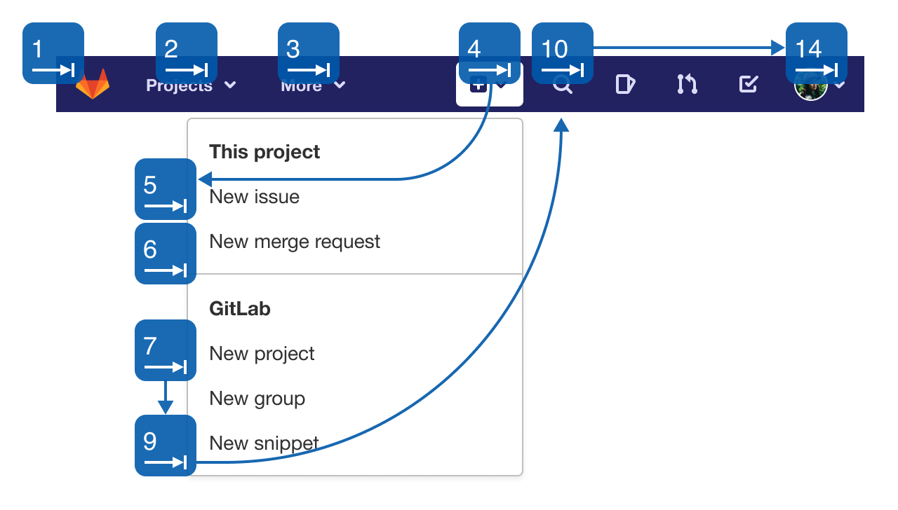
Keyboard accessibility is one of the most important aspects of web accessibility. Many users utlilize keyboards to navigate websites, while others may use modified keyboards or other hardware that mimics the functionality of a keyboard. Some key aspects to check for are:
- Focus Indicatiors: Keyboard users typically use the Tab key to navigate through interactive web elements such as links, buttons, input fields, etc. When an item is tabbed to, it should have a keyboard "focus", or visual indicator, of the element currenty selected. Focus indicators will generally be provided by web browsers, but can be modified.
- Navigation Order: As users navigate through a page, the order in which items receive focus is important. Generally, keyboard navigation should follow the visual flow of the page, left to right, top to bottom.
- Keyboard Traps: Tabbable items should not repeat. If they do, keyboard users will essentially become "trapped", and not be able to access items outside of those within the items between the repeated item.
For additional information on keyboard accessibility, visit WebAIM's article on keyboard accessibility: WebAIM Keyboard Accessibility
 Open the image full screen.
If forms are used on a webpage, it is important to evaluate instructions and error messaging to ensure they are understandable and descriptive. While improper form fields can be caught by automated systems, these instructions must be evaluated manually. Some things to look for when reviewing forms:
- Error Messages: Ensure error messages are descriptive. For example, on a field requiring the user to input a date, an error message should read something like "Enter date in the following format MM/DD/YYYY", rather than simply saying "Error".
- Descriptive Labels: Ensure descriptive labels are present at all times.
- Entry Review: Ensure users can review their entries before submission.
- Labels: Ensure required fields are clearly labeled.
- Instructions: For more complicated forms, overall instructions can be helpful for users' understanding.
For additional information on forms, visit W3C's article on forms: W3C Form Instructions
Multimedia should be checked if it exists on a webpage. There are two main things to check for when evaluating multimedia:
- Ensure media players are keyboard accessible.
- Ensure that media with spoken words or visuals that contain information, captions and/or audio descriptions are available.
A best practice for abbreviations is to provide the expanded form immediately before or after its first use on a page. For example, if referring to San Diego State's Accessible Technology Initiative, it is best practice to introduce the abbreviation as "Accessible Technology Initiative (ATI)" before using the "ATI" abbreviation alone.
For additional tests that may contain manual components such as headings, color contrast, descriptive links, and alternative text, visit our Essentials page to learn more: SDSU Digital Accessibility Essentials

