Designing for Accessibility
Benefits of Accessible Design
Accessible design can have many different benefits. When designing, it is important to be mindful of not just designing or building for the use of able-bodied individuals and their needs. By designing and building for accessibility, websites and other digital materials become much easier to navigate for individuals with visual, auditory, motor, and cognitive impairments. Often, practices and techniques used to achieve this are beneficial to the overall user experience and increases compatibility with different devices and browsers. Prioritizing accessibility ensures equitable access to information and enhances the digital experience for all users.
Karwai Pun of Home Office Digital has created a series of posters laying out general guidelines for designing for various disabilities. The link to these posters, along with an article detailing background can be found here: Dos and Don'ts for Designing for Accessibility - Karwai Pun.
Do's and Don'ts for Designing
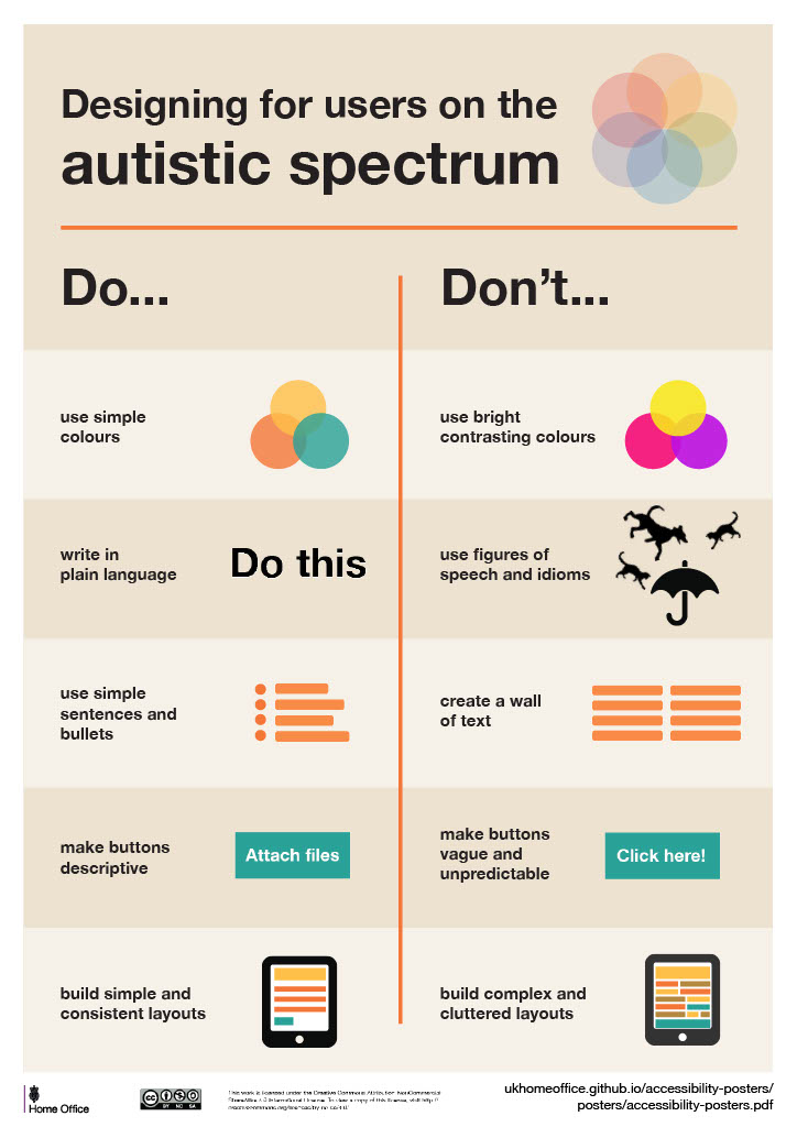
Do
- Use simple colors
- Write in plain English
- Use simple sentences and bullets
- Make buttons descriptive
- Build simple and consistent layouts
Don't
- Use bright contrasting colors
- Use figures of speech and idioms
- Create a wall of text
- Make buttons vague and unpredictable - for example, Click here
- Build complex and cluttered layouts
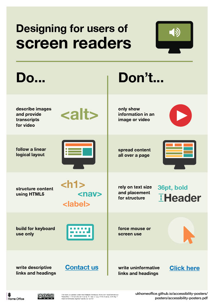
Do
- Describe images and provide transcripts for video
- Follow a linear, logical layout
- Structure content using HTML5
- Build for keyboard use only
- Write descriptive links and heading
Don't
- Only show information in an image or video
- Spread content all over a page
- Rely on text size and placement for structure
- Force mouse or screen use
- Write uninformative links and heading
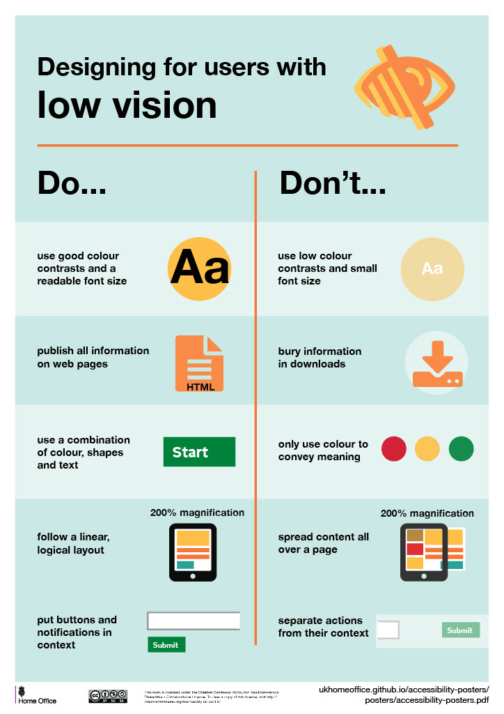
Do
- Use good contrasts and a readable font size
- Publish all information on web pages (HTML)
- Use a combination of color, shapes and text
- Follow a linear, logical layout -and ensure text flows and is visible when text is magnified to 200%
- Put buttons and notifications in context
Don't
- Use low color contrasts and small font size
- Bury information in downloads
- Only use color to convey meaning
- Spread content all over a page -and force user to scroll horizontally when text is magnified to 200%
- Separate actions from their context
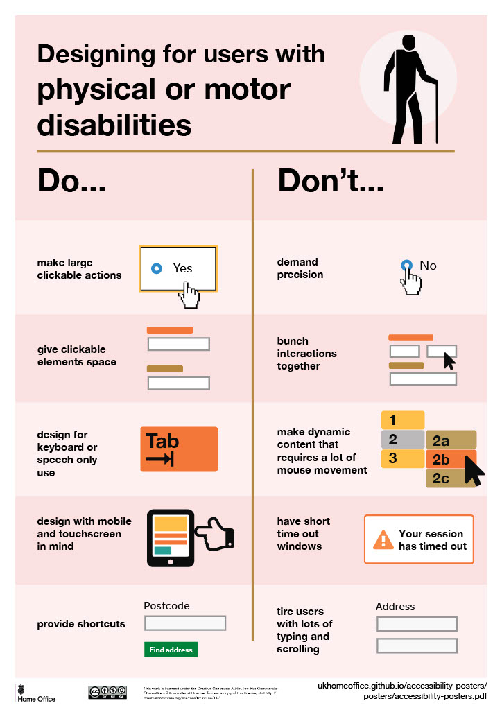
Do
- Make large, clickable actions
- Give form fields space
- Design for keyboard or speech only use
- Design with mobile and touch screen in mind
- Provide shortcuts
Don't
- Demand precision
- Bunch interactions together
- Make dynamic content that requires a lot of mouse movement
- Have short time out windows
- Tire users with lots of typing and scrolling
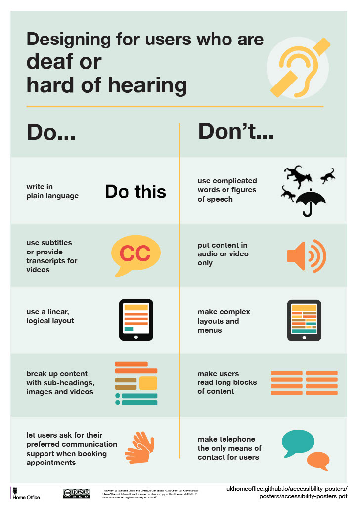
Do
- Write in plain English
- Use subtitles or provide transcripts for video
- Use a linear, logical layout
- Break up content with sub-headings, images and videos
- Let users ask for their preferred communication support when booking appointments
Don't
- Use complicated words or figures of speech
- Put content in audio or video only
- Make complex layouts and menus
- Make users read long blocks of content
- Make telephone the only means of contact for users
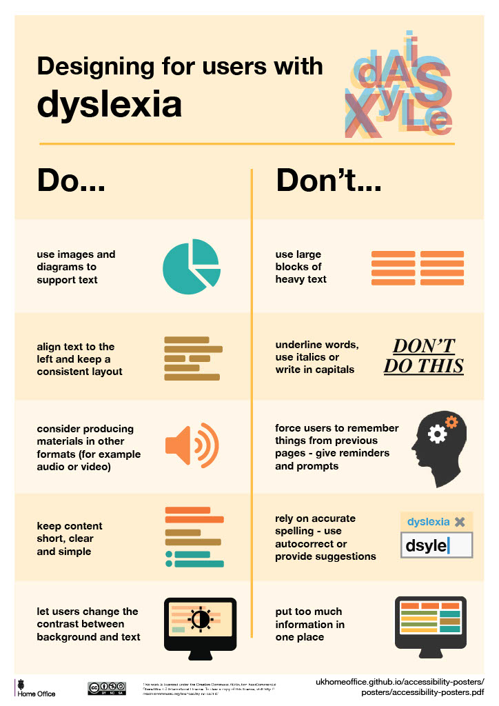
Do
- Use images and diagrams to support text
- Align text to the left and keep a consistent layout
- Consider producing materials in other formats (for example, audio and video)
- Keep content short, clear and simple
- Let users change the contrast between background and text
Don't
- Use large blocks of heavy text
- Underline words, use italics or write capitals
- Force users to remember things from previous pages - give reminders and prompts
- Rely on accurate spelling - use autocorrect or provide suggestions
- Put too much information in one place
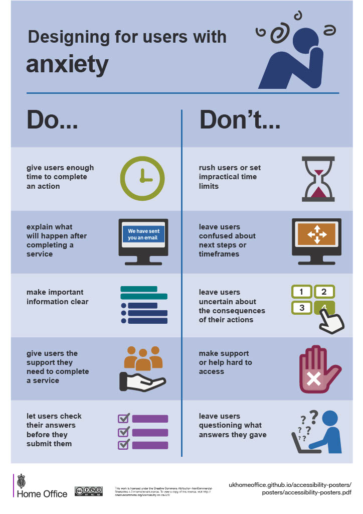
Do
- Give users enough time to complete an action
- Explain what will happen after completing a service
- Make important information clear
- Give users the support they need to complete a service
- Let users check their answers before they submit them
Don't
- Rush users or set impractical time limits
- Leave users confused about next steps or timeframes
- Leave users uncertain about the consequences of their actions
- Make support or help difficult to access
- Leave users questioning what answers they gave