Graphs and Charts
Graphs and charts use visuals to convey complex images to users. Because they are usually images, these images can create accessibility issues to colorblind users and users of screen readers. Ensuring these images are properly formatted with labels, colors, alternative text, and readable information can help allow accessibility to all.
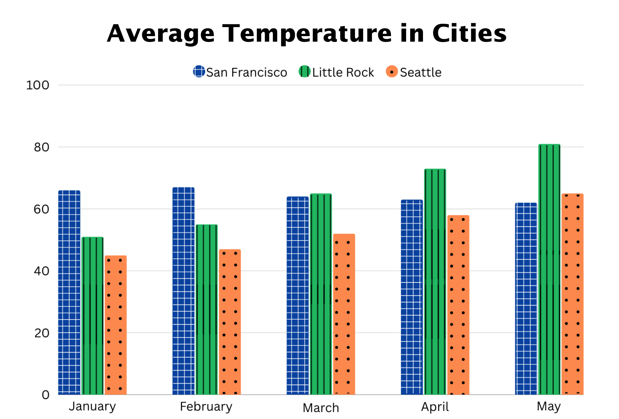 Open the image full screen.
Why should I think about accessible Graphs and Charts?
Consideration of accessibility when creating graphs and charts is crucial for various user groups, including:
- Visually Impaired Users: Users with blindness or other visual impairments may use adaptive technologies, such as screen readers or magnifiers, to view these images. By relying on visuals alone, important information may be missed by these users.
- Colorblind users: People with color vision deficiencies may have difficulty distinguishing certain colors. By ensuring sufficient contrast, you can enhance the legibility of content for colorblind users.
DOs and DON'Ts
- Be Mindful of Color Choice: Instead of relying solely on color, incorporate other elements like patterns or shapes to convey information. This helps users who may not perceive color accurately.
- Label Visuals: Labeling visuals will allow for colorblind users to distinguish between different visuals on a chart. It will also allow everyone to read the chart as intended.
- Add Data Tables: Adding an accessible data table below your graph that presents the same information as your visual can allow accessibility for users utilizing screen readers. This will allow users to access the information in a more accessible format.
- Add Alt Text: For additional information, visit our alt text page: Alternative Text Guide. Adding alt text can provide context to readers. When creating alt text, keep descriptions short, ideally below 150 characters. Try to add descriptions about key findings and what you want readers to take away from the visual.
- Add Long Descriptions: If a visual can't be described using alt text, you might need to include a longer description alongside it. This longer description should be in plain text and can be as detailed as necessary to explain the image to your audience. This usually works well as supplementary content for your chart or graph.
- Rely Solely on Color: Avoid conveying important information or instructions solely through color. Ensure visuals feature alternative forms of differentiation, such as labels and patterns. Users with color vision deficiencies or using adaptive technologies may miss crucial details.
- Use Green and Red Color Combinations: Green and red color combinations are generally inaccessible to colorblind users. Avoid using this color combination as much as possible.
- Forget Alt Text and Descriptions: People using screen readers will likely need alternative methods to receive information contained on visuals. Add alt text and/or a long description to ensure everyone can view the information.
Below is an example of an accessible chart:
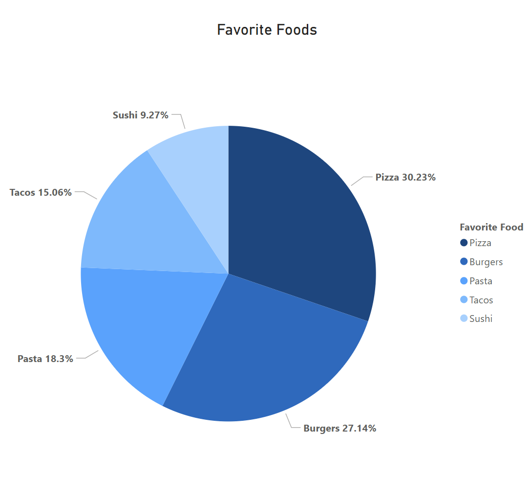
Alt Text: Pie chart depicting five different favorite foods. Pizza is the most favorite at 30.23%. Sushi is the least favorite at 9.27%.
Long Description: This pie chart shows the favorite foods of those surveyed. Respondents said that Pizza was their favorite food at 30.23%, followed by Burgers at 27.14%, Pasta at 18.3%, Tacos at 15.06%, and finally Sushi at 9.27%.
Table: For additional guidance on creating data tables, visit the following link: UC Berkeley Accessible Data Table Guide
- Accessible color palette generator: Venngage color palette generator
- Tableau Accessibility Guide: Best practices for designing accessible views
- Complex Image Guide: W3C Complex Images Guide
- How to Use AI For Long Image Descriptions: Penn State - Using AI For Alternative Text on Images
- UC Berkeley Graphs and Charts Guide: UC Berkeley Accessibility - Graphs, Charts, and Complex Images