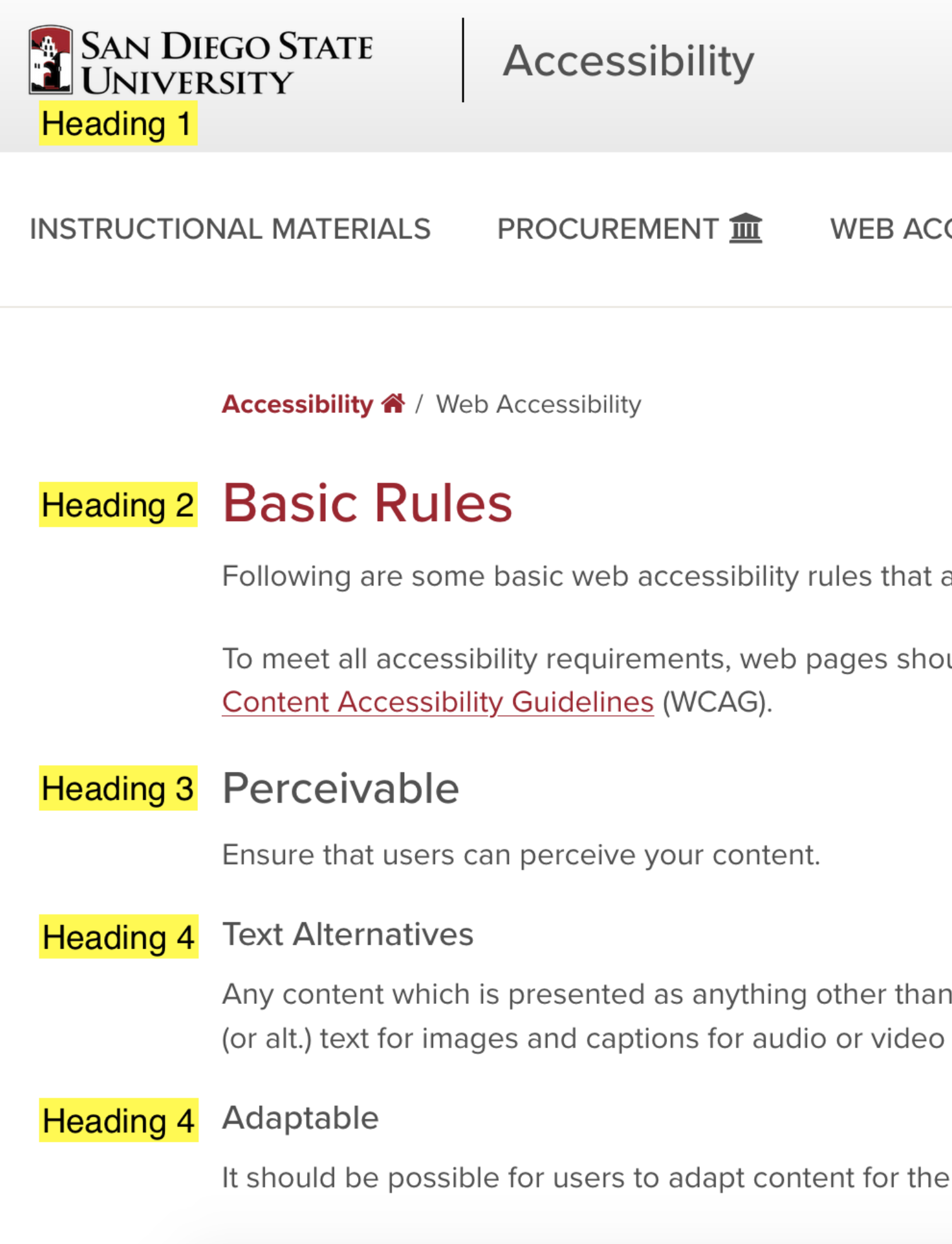
Web Accessibility
Basic Rules
Digital Accessibility is achieved when all people can equitably access content on the web or in applications.
Many of the applications we use to communicate, collaborate, and share enable accessibility, but access for all doesn't happen by default. Everyone who shares content in a digital format (course sites, websites, email, documents, presentations, etc.) must take action to create an equitable experience for all.
The intent of this page is to provide some basic web accessibility rules that all content contributors should be able to utilize to ensure some level of accessibility.
To meet all accessibility requirements, web pages should be evaluated and repaired by someone with the appropriate technical skills and knowledge of the Web Content Accessibility Guidelines (WCAG).
WCAG Overview
WCAG is divided into four principles which provide the foundation for web accessibility:
- Perceivable: Information and the user interface must be perceivable to users.
- Operable: The user interface and navigation must be operable.
- Understandable: Information and the user interface must be understandable.
- Robust: Content must be interpretable by a wide variety of technologies.
The 12 guidelines of WCAG are intended to help authors ensure that they address these principles for people with disabilities.
An Accessible Approach
Keeping the WCAG principles in mind, it is possible to develop an accessible approach to providing content on the web. Build the document with the appropriate structure. Documents should use the appropriate titles, headings, and labels to help users find and understand the content on the website. The structure of the document (and the website as a whole) should help users navigate, determine where they are, and find the content they are looking for.
Page Title
- Page titles should be unique and briefly describe the page's topic or purpose.
- The length of a page's title should be no longer than 70 characters. Some systems (such as OU Campus) may append the name of the site and/or university to the title, which will count towards the 70 characters (as do spaces).
- If a page's content changes significantly enough that the title is no longer accurate, the title will need to be updated.
Headings and Labels
Headings and labels describe the topic or purpose of their associated content or controls. Accessibility tools may provide users with a list of headings to make it easier for them to find the desired content and navigate within the document. Don't use bold, italic, or other methods of changing the appearance of the text in place of headings.
Use the appropriate heading levels
- Don't choose heading levels based on appearance.
- Don't skip levels when moving to higher numbers (1, 2, 3, 4, 5, 6).
- If you skip levels when moving to lower numbers (6, 5, 4, 3, 2, 1), make sure the structure makes sense in context with other headings at the same level.
Tables
- Use tables to present tabular data, not to present content. It may seem like it is easier to control layout with a table, but table accessibility is difficult to configure and table-based layouts are more difficult to adapt to varying screen sizes.
- Designate cells within the table as headings (the method of doing this will vary based on your environment). Do not use content headings (h1-h6) or modify the appearance of text (e.g. using bold/strong or italics/emphasis) to imitate table headings.
- Designate whether a header cell applies to the cell's row or column.
- Tables generally require a higher level of technical expertise to ensure their accessibility, so it is best to ensure that tables are the appropriate tool for the information being presented and to request help to ensure the table is accessible.
Adjust the Document's Appearance
After building the document's structure, use the provided tools to modify the appearance of the content.
Technical Note
This usually means applying classes to the structural elements which are associated with CSS that will modify the appearance of the content. Styles should not be applied directly to the HTML elements, as this makes it more difficult for the users' tools (or later designers) to modify the appearance for their needs.
For example, Modern Campus CMS provides two dropdowns in the toolbar:
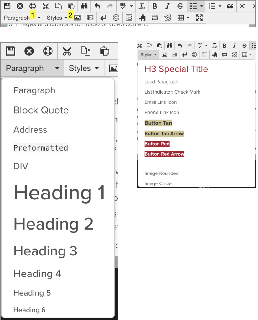
- A dropdown listing structural elements (Paragraph, Heading 1 - Heading 6, Block Quote, etc.)
- A Styles dropdown to modify the appearance of the elements. (Technical note: this dropdown applies classes to the HTML elements, so the name can be misleading.)
When placing content into the page, use the first dropdown to build the document's structure by setting heading levels, designating blocks of text as paragraphs, block quotes, etc. The default styles in the website's design will be applied to the text.
Once the document's structure is in place, use the Styles dropdown to modify the appearance of content as desired. This dropdown allows selection of multiple items which can be applied to the same text, so an indicator is displayed in the dropdown for the currently selected item(s) (selecting the item from the dropdown a second time will remove it).
So, if you prefer the appearance of a level 3 heading but the document's structure requires a level 4 heading, select Heading 4 from the first dropdown and select "Simulate H3" from the Styles dropdown. Keep in mind that the appearance of each heading level should be consistent in your document if you don't want users to get confused, though.
Positioning Content
- Don't use line breaks, whitespace, or text to position/align content. These are considered content, so using them to modify the appearance of your content will make it difficult for users and future designers to adjust the content to their needs.
- A method may be provided to allow you to modify the space around content elements (e.g. the space between a heading and surrounding paragraphs, the space between paragraphs, etc.), but this should be done sparingly, and care should be taken to ensure some consistency.
Links, Buttons, and Menus
Links are used for many purposes within a web page. In most cases, buttons, dropdowns, menus, and controls on many forms of user interfaces (e.g. the headings in an accordion, tabs, etc.) are just links with specific CSS and/or JavaScript applied to change their appearance or supply their functionality. Therefore, if you want to create a button, it is often just a matter of modifying the appearance of a link.
Link Purpose
The purpose of a link should be identifiable from the text of the link alone. If there are multiple links to the same place, they should use the same text. Keep in mind, especially when linking to other pages on the same site, that there may already be links in the site's header, footer, or other navigation which point to the same location.
Most systems allow you to enter a title for a link. When using most common browsers and a mouse, the title usually appears when the user hovers the mouse cursor over the link. The current best practice is to not use the title, but if you do so, it should provide information that is not available in the link's text. Do not use the same text for both the title and the text of the link.
A link's text should not be the URL (or address) of the link. The URL may not clearly identify the content or purpose of the linked page. Additionally, when content is written to use a URL to link to a page, the content or purpose of the link is often provided in the content but is not clearly associated with the link for users of accessible technology.
- The text of a link should describe the purpose or content of the linked URL.
- All links on a page which point to a given URL should use the same text.
- The link's title should not be used.
- If the title is used, it should provide additional information not provided by the link's text (and not match the text).
- Links must be identifiable in content by more than just a change in color. Do not remove decorations which help distinguish the links from the surrounding content (e.g. underlines).
- Do not decorate other text in ways that might confuse users by making the text look like a link (e.g. underlining text).
Any content which is presented as anything other than text will need a description or alternative presentation. The most common examples of this are alternative (or alt.) text for images and captions for audio or video content.
Use of Color
- Color must not be the only means of conveying information. For example, if items in a list are presented in different colors based on their status, there needs to be another method of conveying that information, as well.
- Text must be presented with sufficient contrast. For example, when presenting text in SDSU Red, the background should be white or another color with sufficient contrast; black or other dark colors should not be used with SDSU Red.
Resize/Reflow
Content should not require users to scroll in two dimensions (unless displayed at resolutions below 320 vertical pixels or 256 horizontal pixels). Users (or accessibility tools) should be able to modify foreground/background colors, font size, line height (line spacing), letter spacing (tracking) and word spacing without loss of content or functionality.
Audio
If any audio plays automatically for more than 3 seconds, controls to stop/pause the audio or control the volume (independently of the system volume) must be provided.
Operable
Users must be able to navigate the website and operate any user interface components.
Keyboard Accessible
All functionality of the content must be operable using a keyboard (without a mouse). Functionality must not require specific timing for individual keystrokes
Enough Time
Enough time should be provided for users to read and use content. If time limits are set, users should be provided with options to adjust/extend or turn off the time limits. If information is moving, blinking, scrolling, or auto-updating, the user should be provided with a method to pause, stop, or hide it. Web pages should not contain anything that flashes more than three times in any one second period. Do not design content in a way that is known to cause seizures or physical reactions.